
Premium cocktail bar website featuring headless Shopify store
One venue, three experiences.
Performance, colour accuracy, and thoughtful UX.
The website was built using a modern JavaScript framework to ensure fast, responsive performance across devices. All menu and event data are stored in a PostgreSQL database with key-value caching, allowing the team to update offerings in real time without impacting site speed—critical for a venue that regularly updates menus, runs pop-ups, and limited-time events. The site consistently achieves 100s on Lighthouse and passes all Core Web Vitals, ensuring a snappy experience regardless of connection speed or device capability. The e-commerce platform is a headless Shopify instance, giving flexibility to sell merchandise and pre-batched cocktails while maintaining design cohesion with the main site.
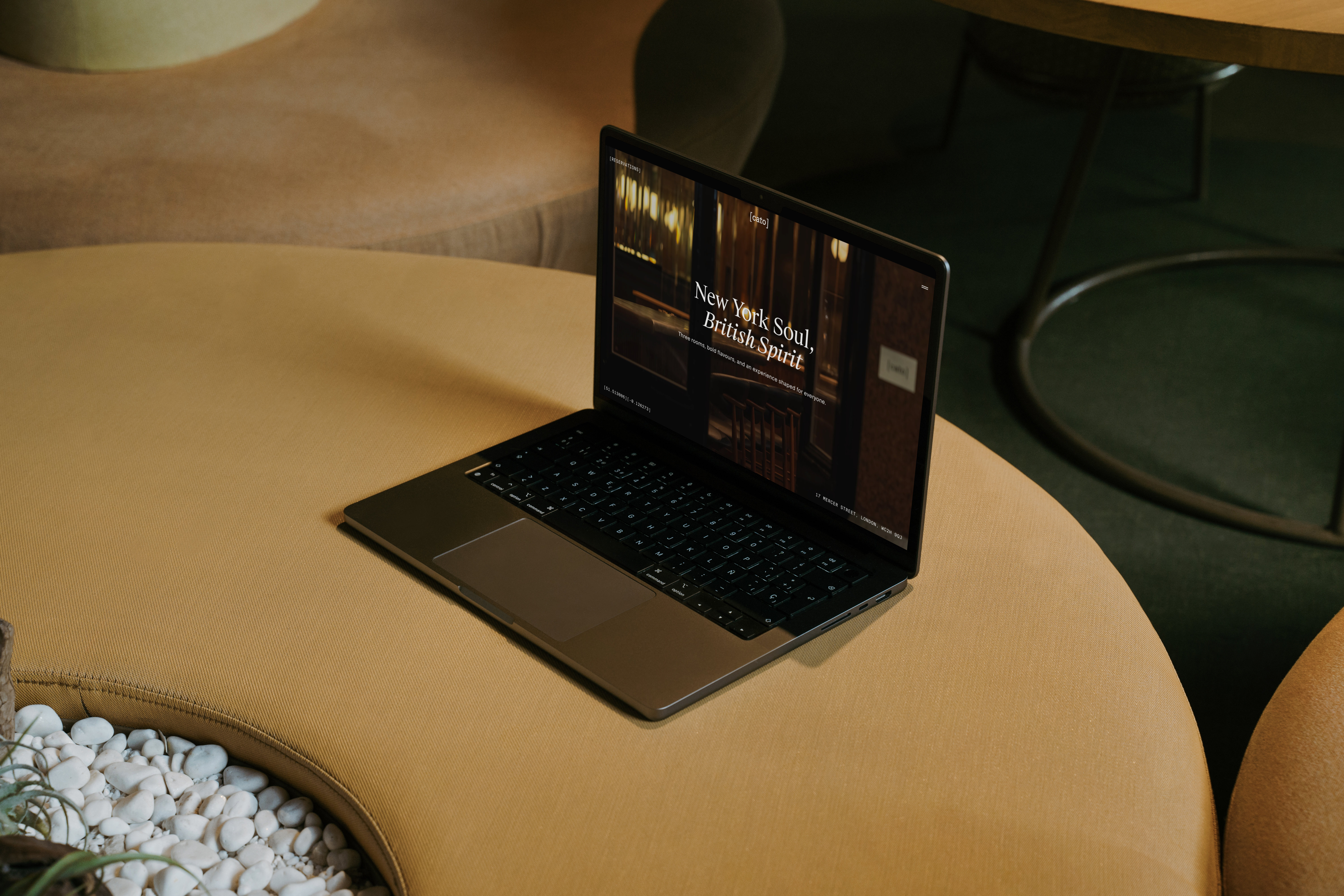
A defining technical and creative challenge was honouring the colour theory foundation of Cato’s main drinks list. In the physical space, each colour group in the menu comes with a coloured paper insert containing key ingredient details. To translate this tactile, visual experience online, a modal system was designed: each cocktail features a plus-symbol button that opens a colour-matched modal displaying details about the key ingredients’ origins. This preserves the visual storytelling of the physical menu while creating an intuitive, discoverable interface that feels native to the digital experience. The menu system also includes intelligent filtering by dietary requirements, allowing guests to view a customised menu before arrival.
Equally important was ensuring true-to-life colour accuracy. A custom image pipeline ingests photography in the Display P3 colour profile—a wider gamut that captures more of the vibrant, nuanced colours our eyes are capable of seeing. These images are exported at multiple sizes in both Display P3 (for devices that support it) and sRGB (for broader compatibility), meaning visitors on modern screens experience photography closer to the in-venue reality, while all users benefit from optimised load times and responsive images.
The e-commerce experience prioritises performance and transparency. The cart uses optimistic UI updates, providing instant feedback when products are added—no waiting for Shopify’s APIs to respond. Cart state is persisted in local storage and validated against Shopify’s backend, ensuring data integrity without sacrificing responsiveness. A key feature: the cart syncs in real time across browser tabs. If a user is browsing merchandise in multiple tabs, they see the true cart subtotal everywhere—a small detail that prevents the confusion of fragmented shopping experiences.
Branding — GroundPhotography — Thirsty Media
PR & Comms — Cru Communications